
I was visiting Signet Press yesterday, after my class at the University and the book Am Antir Vhenpu by Bhibhuti Bhusan Bandopadhya caught my attention. Richly illustrated by Satyajit Ray including the three colour cover, is a delight. The illustrations done in the style of wood block impression are masterpieces and reminded me of Ray as a calligrapher.
Satyajit Ray studied at Ballygunge Government High School, Calcutta, and completed his BA in economics at Presidency College, Calcutta, though his interest was always in fine arts. In 1940, his mother insisted that he studied at the Visva-Bharati University at Santiniketan, founded by Rabindranath Tagore. Ray was reluctant due to his love of Calcutta but joined the art school at his mother's insistence and encouragement from Tagore, the great poet, who was a friend of his late father.
While in Santiniketan Ray learned to draw from the great master-teacher Nandalal Bose, a pioneer in art education in Modern India. The other teacher who made an abiding impression on him was Binode Behari Mukherjee. Binode Bihari had trained in China and Japan. Calligraphic elements entered his otherwise modernist oeuvre. With his natural talent in drawing, Ray later developed and deployed this element in his illustrations and graphic designs.
Most know that Ray stumbled upon filmmaking much later in his professional career. A fine arts student from Shantiniketan, Ray's interest and mastery on art got him a job with DJ Keymer, a British-run advertising agency, as a 'junior visualiser. Ray worked at the agency for almost 13 years before quitting the job to take up filmmaking as a full time profession. During his stint at Keymers he met D K Gupta the owner of Signet Press. Signet Press is a publishing house established by D. K. Gupta in 1943. Satyajit Ray worked as a visual designer in this publishing house and many of the books don the covers designed by him. The press has published many renowned books like Jawaharlal Nehru's Discovery of India, Bibhutibhushan Bandopadhyay's Am Antir Vhenpu, Jibanananda Das's Rupasi Bangla and others
With the success and international acclaim that his films fetched, Ray slowly started concentrating on the entire process of filmmaking. He directed, wrote the screenplay, and composed music for many of his films. He even designed costumes for films like Hirok Rajar Deshe and sang one of the songs in the cult classic Goopi Gyne Bagha Byne.
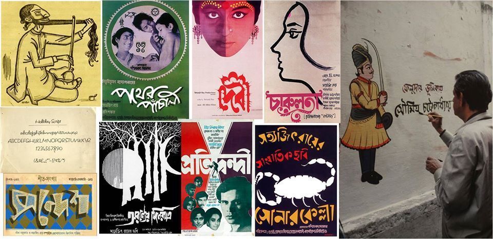
Satyajit Ray also designed the posters using masterly calligraphy to bring out the theme of the film on just a few brush stroke. Ray created his own groundbreaking posters, with which he distilled the themes and moods of his films into a single image – in effect, a paper trailer that was posted all over streets of Calcutta. He started with the poster of Debi and returned to do the poster of Pather Panchali for it’s re-run. This was followed by all his films.
The poster of Pather Panchali was an antithesis of extravagant Bollywood, the poster for this realist, lyrical and humane film incorporates folk-art-tinged design and hand-drawn motifs – as if Apu, the film’s six-year-old protagonist, had scribbled them himself. For Debi the word was stylised as the ‘Chalchitra’ which is placed at the back of the Durga idol. Moreover, a hallucinatory design illustrates a pivotal scene in this 19th-century period study of religious superstition.Here, the division of the young girl’s face represents her split identity. In Charulata ,Ray’s command of portraiture can be observed throughout his graphic work, from the faces of characters he sketched for children’s stories Here his fragile, minimal brushstrokes bring alive the longing of the film’s lonely housewife for her husband’s cousin. Ray borrowed the ornate style of the title’s calligraphy from his hero, the poet Rabindranath Tagore, whose short story the film was based on.
Satyajit Ray deviated in In Kapurush-Mahapurush with the surreal image showcasing unusual treatment of photography at a time when most Indian film posters were printed in stone litho but returned to Caligraphy for the title. In Aranyer Din Ratri there is the mysterious nocturnal image, Ray shows the film’s true protagonist: the forest that transforms the four arrogant Calcutta bachelors who stay there during a weekend road trip in this still-timely fable about India’s urban-rural divide. In Pratidwandi , Ray who is often accused of ignoring politics; takes it headlong. Set amid the upheaval and violence of 1970s when Calcutta was in the grip of Naxalite radicalism, he draws attention to this with the hand-drawn figure of a gunman at the centre of the film’s fractured title block. Ray would often design a number of different posters for each film. One version for The Adversary sees Ray experimenting further with the logo, splintering it as a bullet would. In Sonar Kella he uses his knowledge of his beautiful woodcut illustrations for children’s stories, Ray also wrote and sketched his own detective and sci-fi tales. This adaptation of one of his own novels is told through the eyes of a six-year-old boy, and, continuing the idea he originated with his Pather Panchali poster, Ray made sure the loud, playful lettering and drawings on the poster could have been his character’s creations. And this continued with all of his other films.
Ray's artistic playing with the Bengali graphemes is interesting. The grapheme has been described as the "smallest contrastive linguistic unit which may bring about a change of meaning" It is to be noted that the cine posters and cine promo-brochures' covers reveal the use of graphemes .In his calligraphic technique there are deep impacts of : Artistic pattern of European musical staff notation in the graphemic syntagms and alpana ,ritual Hindu design, mainly practised by Bengali women at the time of religious festival ; categorised as folk-art in Ray's graphemic representations.
Thus, so-called division between classical and folk art is blurred in Ray's representation of Bengali graphemes. The three-tier X-height of Bengali graphemes was presented in a manner of musical map and the contours, curves in between horizontal and vertical meeting-point, follow the patterns of alpana. It is also noticed that the metamorphosis of graphemes (This might be designated as "Archewriting") as a living object/subject in Ray's positive manipulation of Bengali graphemes.
Ray also did the title cards for most of his films and in Sonar Kella he uses calligraphy for the title accompanies by a colour drawing actually executed on the wall. You can just imagine the number of drawings and calligraphy executed by him.
Most Bengalis also credit Satyajit Ray for making them love their language and the typography. Ray introduced an unique calligraphy of the Bengali text which is still used in several publications and books of Signet Press and known as the Satyajit Ray style. He also designed four typefaces for roman script named Ray Roman, Ray Bizarre, Daphnis, and Holiday Script, apart from numerous Bengali ones for the Sandesh magazine. Ray Roman and Ray Bizarre won an international competition in 1971.
Ray's interest in typography did not actually start with metallic letters used for printing but with calligraphy done with a thick brush. The flamboyance of Ray's calligraphic typography first attracted people's attention in 1943, the year he started designing the covers for Bengali books published by Signet Press. He also designed advertisements for new publications to fill the very small spaces of the well-liked periodicals printed in newsprint.
The young Ray, often had to design collections of modern Bengali poems. For the covers he found no metallic type suitable enough to go with the moods of the poems. Therefore he depended almost entirely on his own skills for calligraphy. Ray created many new Bengali typefaces which have refreshingly innovative yet perfectly legible form.
The typefaces designed by Ray may be classified into two different streams: architectural ,replicable and calligraphic ,non-replicable.Ray designed architectural typefaces for the titles or logos that would be repeated for a given period in all the issues of periodicals, including Sandesh, the children’s magazine he edited. On the other hand, he quite often designed calligraphic letterings for the frontispieces that would be printed only once.
Ray is the first and possibly the only designer of typefaces in Bengal who inspired an entire community to love the beauty of the letters of their mother tongue. One of the reasons for the Bengali's love of reading is their ability to appreciate the beauty of the Ray typography.